Back to Projects

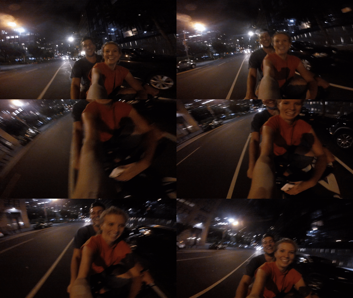
I recently used the Citi bikes in NYC. One night my wife and I were biking around Brooklyn and my phone died. At this point, we were almost 2.5 miles from our car and it was getting late. Since we couldn’t rent another bike from her phone, I ended up riding on the back of her bike the whole way back. You can guess that this option was not comfortable or safe but there was no way to rent another bike and we didn’t want to walk.
As I thought on this experience I felt like Lime riders may have a similar issue. During this case study, I wanted to explore a way to solve this problem.
A feature allowing a Lime user to rent multiple scooters on one mobile phone is not currently available. Lime users have complained throughout app store reviews about the lack of this kind of feature.
Design a feature on the mobile Lime app for users to rent multiple scooters on a single phone.
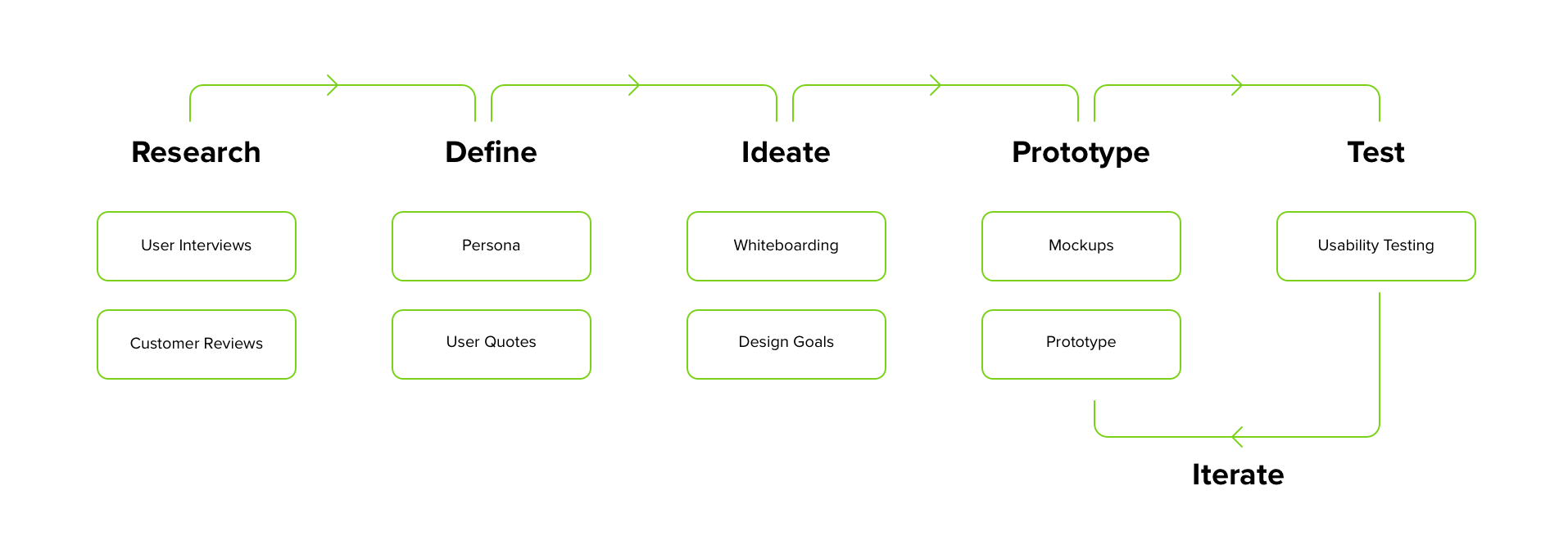
Before diving into any problem, it’s important to understand the users and the problem more deeply. To start my process, I wrote down some important questions to consider:
I interviewed 6 people that use Lime on a weekly basis. My goal was to learn about use cases surrounding this problem and why they might need this feature.
A group of friends/family/co-workers want to go ride scooters together around the city...
From talking to users, I learned that most of them find other forms of transportation as a group if faced with the use cases listed above. Other forms of transportation included Uber, Lyft and public transportation.
In order to find more data, I went through app store reviews and found many people complaining about this lack of feature. I also found a survey conducted by Lime in San Francisco. The survey indicated that 10% of Lime customers use the service for recreation. Based on that information, my assumption is that recreational Lime riders travel in groups.
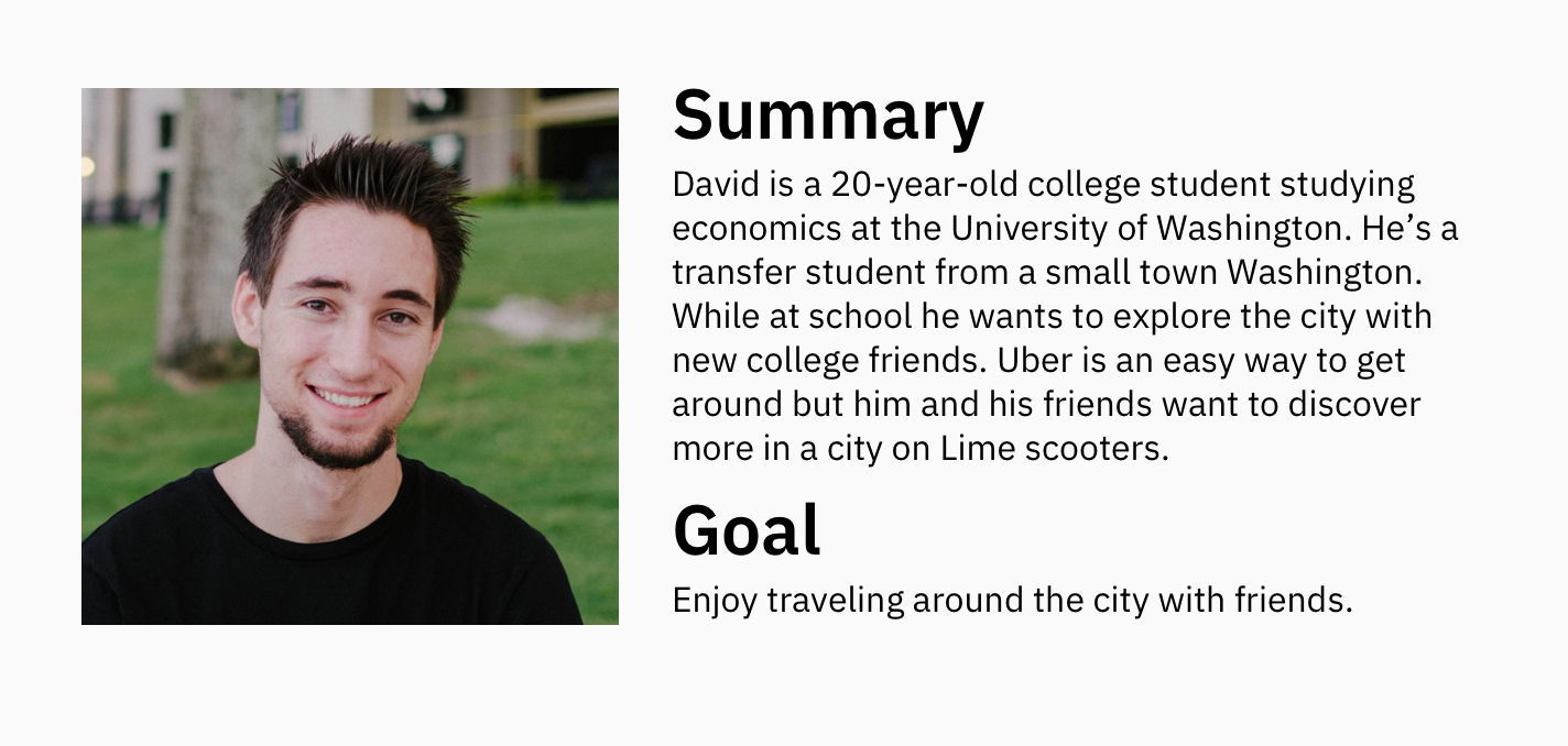
Based on my research and discovered use cases, I developed a persona who rides Lime scooters in groups recreationally.
Solving this problem could help benefit the business and customer:
I started my ideation process by sketching on a whiteboard. After brainstorming, I felt that visibility and user control were important heuristic evaluation principles that I needed to focus on while designing. I felt this way because a user renting 2-5 scooters will want to be able to view how many scooters they have rented and have the ability to end scooter rides at any time. I designed components to represent each rented scooter with the QR code provided.
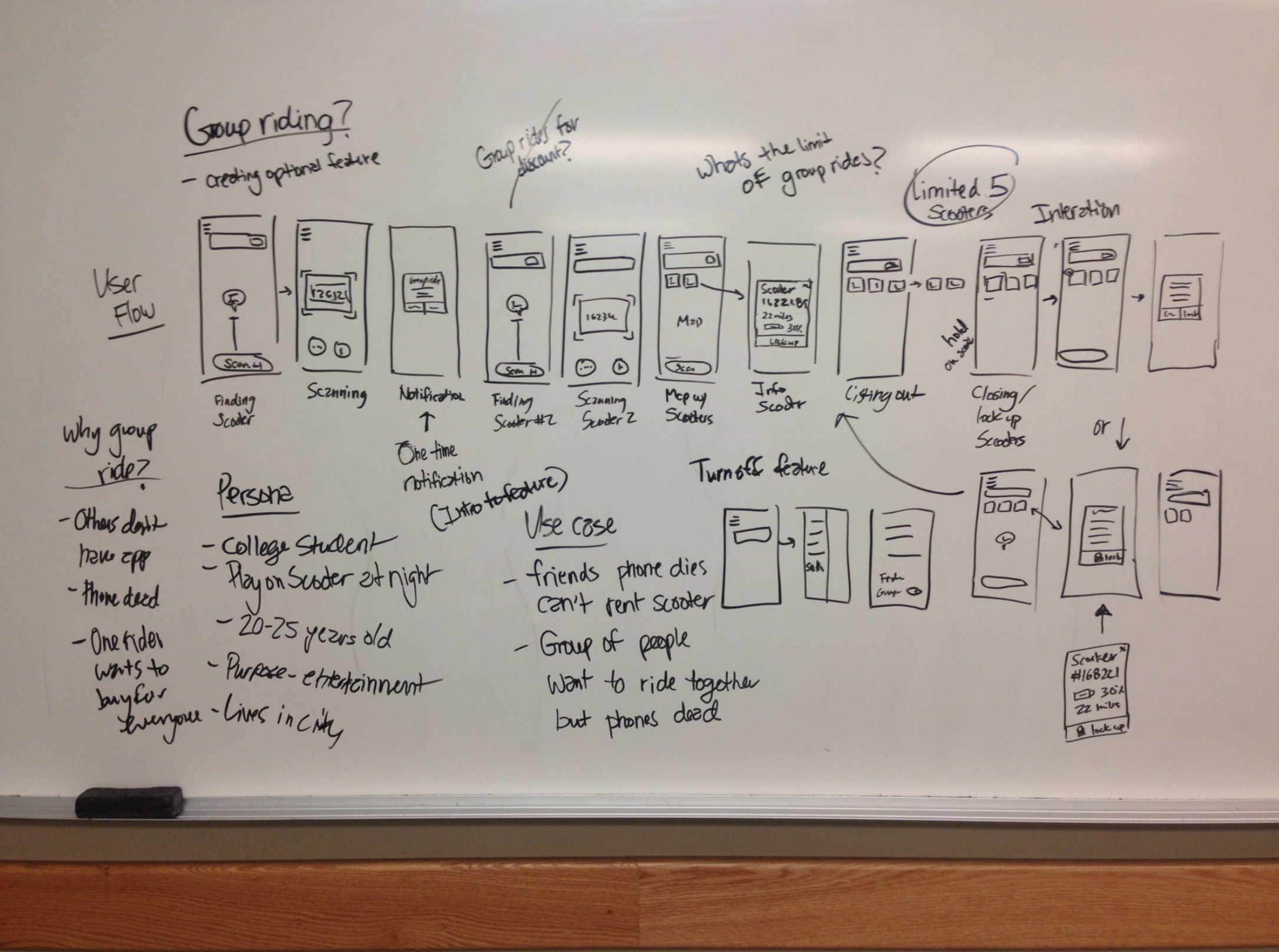
I iterated a few times on the best way to design this component. As I iterated, I placed the component in the context of the screen to better understand how it interacted with the product.
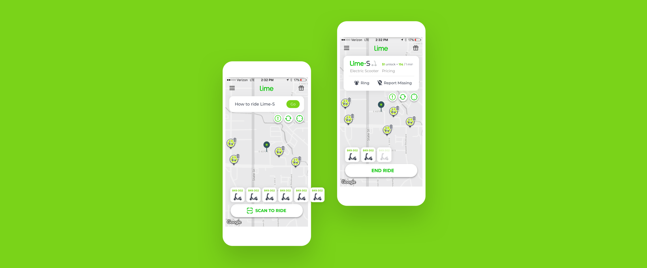
I decided on the last component due to the limited screen real estate on the mobile app. The QR code is easy to access and large enough to read.
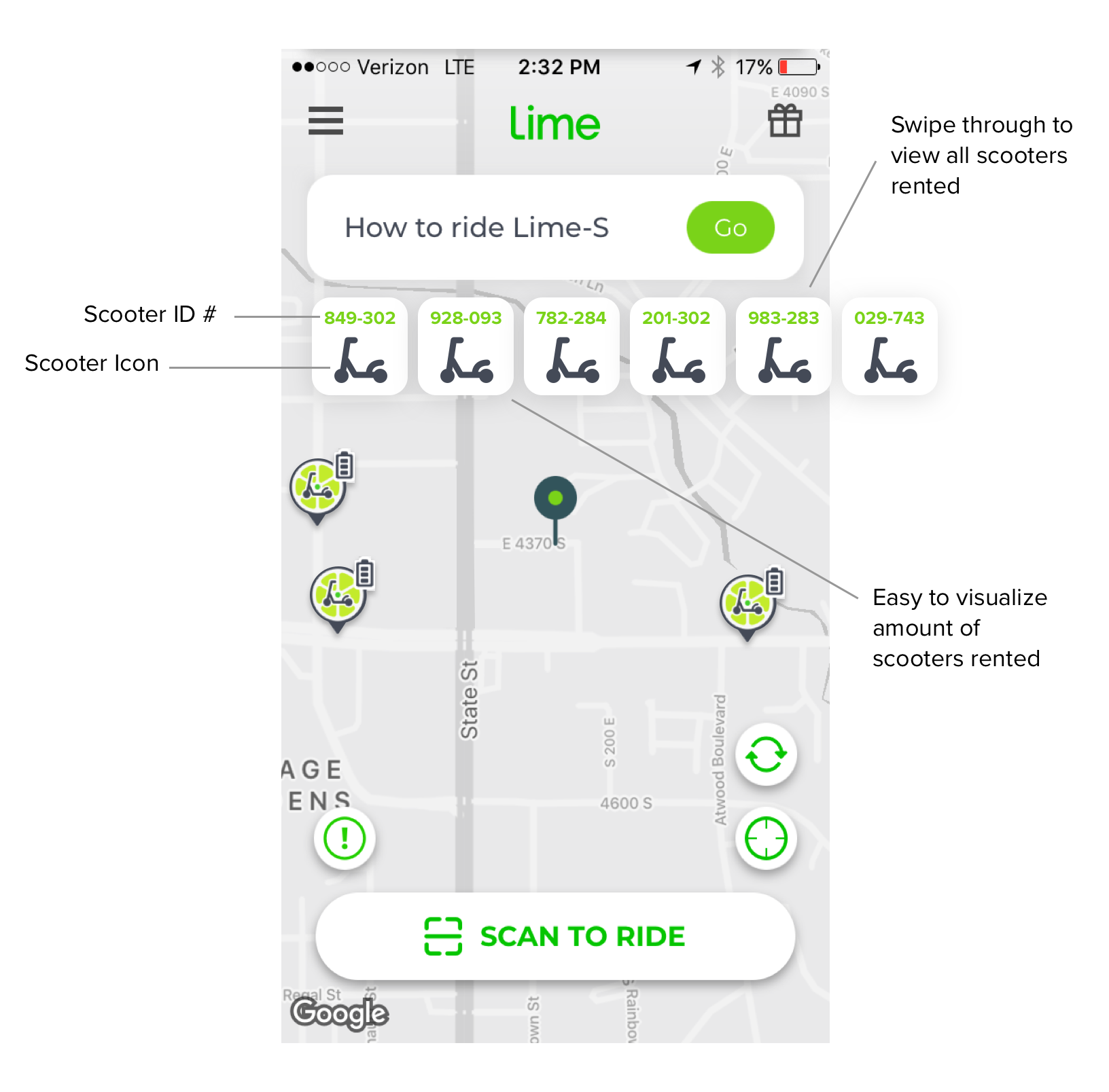
To gather user feedback on the feature idea, I built out a prototype in Adobe XD and tested it with 5 users.
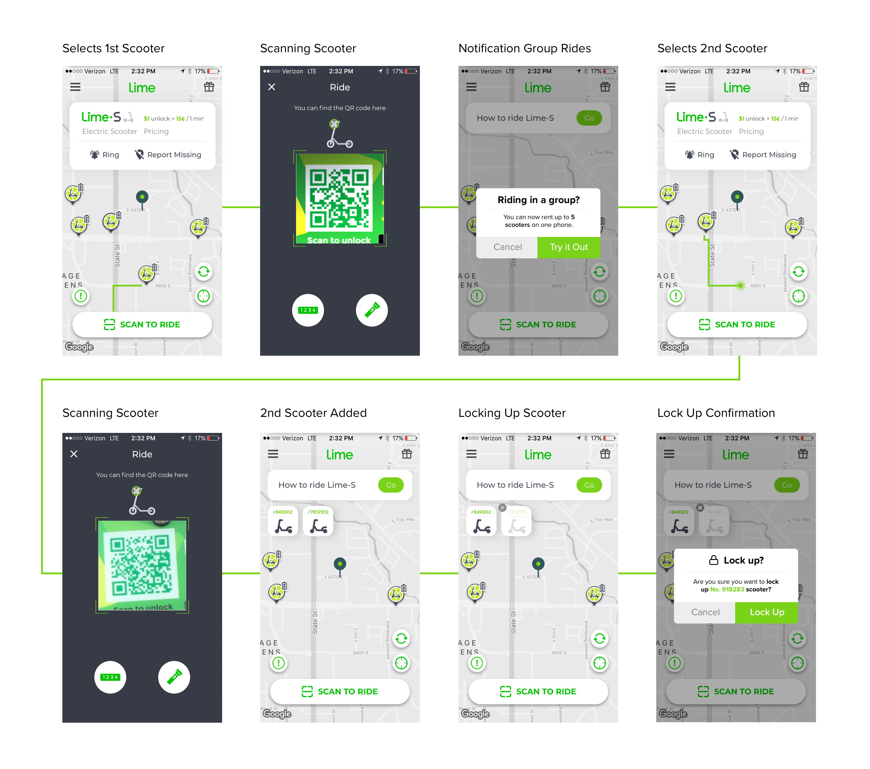
I had high hopes that the interaction of ending a scooter ride could be similar to deleting an app on an iPhone. Turns out users were confused and felt it took to many steps.
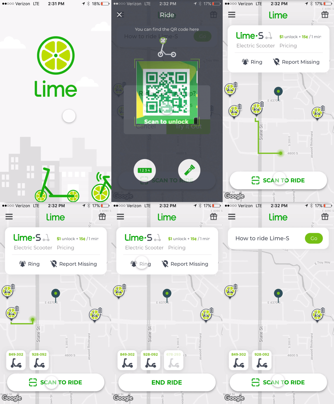
To find a better solution, I did rapid sketching on paper. As I sketched out each flow, I wrote down the pros & cons of the design. I decided on option 3 for a few reasons:
To help users be aware of which scooter is which, I allowed the user to access the ringer ball to help find out which scooter to end.
Next Project